

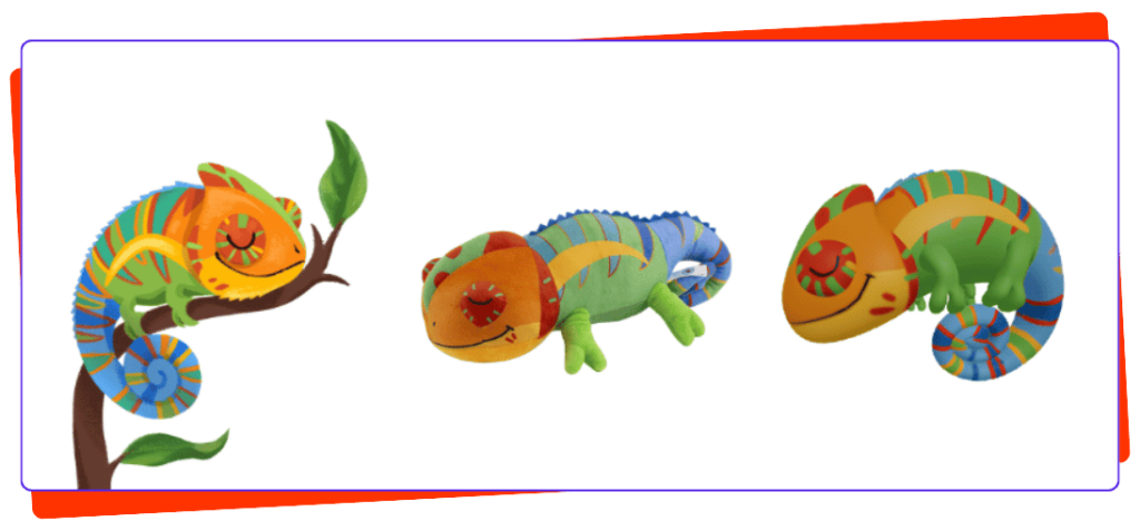
Creating a mascot is not just about drawing a cute character. For it to really work, it needs to be easy to recognize, simple to adapt, feasible in real-world conditions, and endearing enough to make children want to find it again.
Here are some very concrete rules to apply, from graphic design to production, illustrated by examples of well-known mascots.
1. Limit the mascot to 2 or 3 main colors
A mascot with too many colors quickly becomes difficult to recognize and potentially difficult to produce if it becomes a product. Ideally, it should use two or three strong colorsfrom the brand's visual identity. This makes it an easily identifiable character across all media: children's menus, posters, games, stickers, plush toys, or keychains.
Example : the clown from the famous fast-food chain relies solely on red and yellow, the brand's two traditional colors. The result: even as a blurry colored silhouette and without revealing its name, it's instantly recognizable.
To plan ahead : define these colors using exact codes (Pantone, RGB, CMYK) at this stage rather than at the end. A red that varies slightly from one medium to another (print, screen, plush fabric) breaks visual consistency without always being clear why.
Key point : in visual identity, it is generally considered that a character recognizable in 2-3 colors has a much shorter memorization time than a multicolored character, a child first processes the color before the shape in their visual recognition.
2. Choose a silhouette that is recognizable even without a logo
Before adding a logo to the character, you need to ask yourself a simple question:
Is the mascot recognizable solely by its shape?
A good mascot should have a distinctive element: large ears, a round shape, a particular hairstyle, a tail, a hat, an animal shape, or an accessory.
Example : The silhouette of a famous cartoon mouse, reduced to three circles (a head and two ears), remains recognizable worldwide without any color or detail. This is the most frequently cited example in character design to illustrate an ultra-strong, minimal silhouette.
The goal is for a child to be able to recognize the character from a distance, even as a black silhouette or shadow puppet. It's a good quick test: if the outline alone is still enough to identify the character, the silhouette is strong.
3. Avoid the small details
Very fine details sometimes work well on an illustration but much less so on a plush toy or a personalized item.
It is best to avoid: highly detailed fingers, tiny patterns, overly delicate accessories, or elements that are difficult to reproduce.
Example : the white tire man from a tire brand is made up entirely of stacked round shapes, without any fine details. This is precisely what allows it to exist both as a large inflatable statue and as a small keychain, without ever losing its legibility.
A good approach is to envision the mascot from the outset as a 15 or 20 cm plush toy. If certain details become invisible at this size, they are probably unnecessary.
4. Focus primarily on the eyes and mouth
The face is what children look at first.
Therefore, an immediately understandable expression should be preferred.
Example : the orange tiger of a famous cereal brand has only a few facial features, but a wide smile and very expressive eyes that are enough to convey enthusiasm, without a single superfluous detail on the rest of the body.
Safety precaution : if the mascot is intended to become a physical object for young children, the eyes must not be made of small, sewn-on or glued-on parts that can be removed. Toy safety standards (such as EN71 in Europe) impose specific requirements for children under 3 years old. Embroidery is preferred for plush toys.
5. Give it a single, strong distinguishing feature
Avoid adding multiple accessories; it's better to choose one truly recognizable item.
Example : A famous pink rabbit from a battery brand relies on a single distinctive element: its yellow t-shirt, worn consistently in all its advertising variations for decades. This accessory then becomes a central element of the character's identity, easier to reproduce on a plush toy or illustration.
Keep in mind : this signature accessory must become an "invariant" of the character, the element that never changes, even if the rest evolves over time (see rule 13).
6. Plan for at least 3 poses from the start
A mascot should not be drawn in only one position.
It is best to plan several poses from the outset: a standing version, a bowing version, and a moving or playing version.
Example : The bear from the laundry detergent brand. Which changes position depending on the product it is in, even in the ads and on the posters where it is used.
7. Test the mascot on 4 different platforms before approving it
Before finalizing the character, it is necessary to check that it works in several situations: on a poster, on a small sticker, on a printed game and in a plush version.
Key point : it is common practice in character design studios to systematically test a character in three sizes (large format, medium size, small format like favicon) before final validation, because a detail that works in large format often disappears in small size.
If the mascot only works as a large illustration but becomes illegible when reduced or transformed into an object, the design must be simplified.
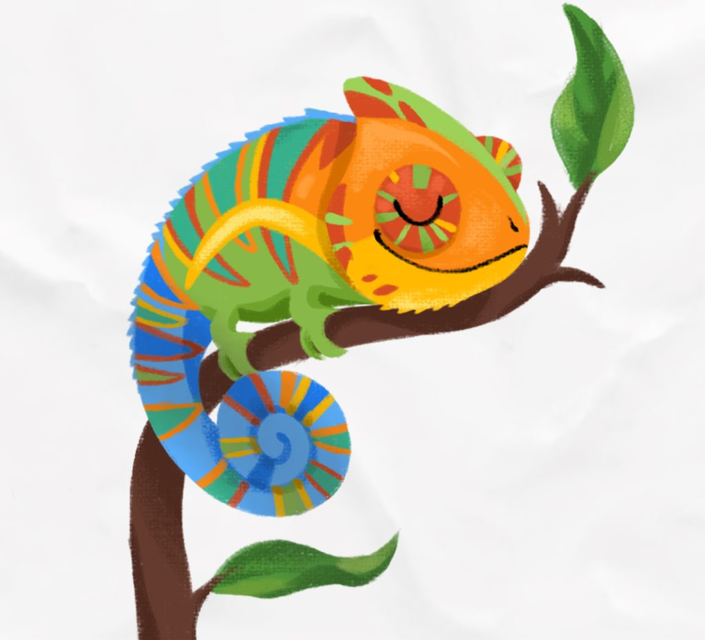
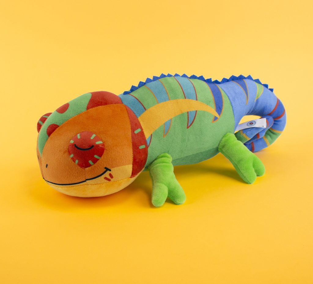
8. Think about the name from the graphic design stage
A mascot that "sounds good" greatly enhances memorability.
The name should be short (ideally 1 to 2 syllables), easy for a 4-5 year old to pronounce, and consistent with the character's appearance.
Example : the mascot names of cereal or fast-food brands aimed at children are almost always very short and rhythmic, designed to be easily shouted or sung in a schoolyard.
9. Anticipate the regulatory constraints of children's marketing
This is often the blind spot for creatives, yet it's a point that can block a project at the end of its development.
Depending on the country, advertising aimed at children is regulated (in France, the recommendations of the ARPP; elsewhere, even stricter rules, such as in Quebec or Sweden, where television advertising aimed at children under 13 is prohibited).
This has a direct impact on the creative brief: no encouragement of excessive consumption, no mascot that minimizes the nature of a sugary or fatty product, and particular attention to characters too close to an existing cartoon hero.
10. Verify the feasibility of a physical object very early on, not just a plush toy
The plush toy is an important test, but it's also necessary to check beforehand if the mascot can be manufactured in:
- rigid figurine (molded, able to stand upright without a base that is too wide)
- inflatable balloon or costume worn by an entertainer (body proportions, visibility and eye comfort through a mask)
- Toy safety standard (EN71 in Europe): no small detachable parts.
Key point : many mascots for amusement parks or sporting events are designed with a head that is deliberately disproportionate to the body, not just for stylistic effect, but because it makes it easier for an entertainer to wear the costume while still being recognizable from a distance.
A character that is only validated on screen may prove unplayable once transposed into 3D.
11. Test directly with children, not just adults
A committee of designers or parents often approves a design because they find it "pretty", whereas children react to different criteria: fear, funny effect, desire to touch.
Key takeaway : Several major toy and children's animation brands systematically incorporate testing phases with young children before the official release of a character, precisely because adult and child reactions differ on what is perceived as endearing, funny, or, conversely, unsettling.
A quick test, showing two or three variations to a panel of children in the target age group, avoids many artistic direction errors that are ultimately approved internally.
12. Create a usage charter (guide style)
Once the mascot is approved, it must be fixed in writing: the colours in exact codes, the proportions, the allowed expressions, the reference poses, and what is forbidden to do.
Key point : Recognized mascot brands publish internal "brand guidelines," sometimes dozens of pages long, dedicated solely to their character, to ensure that a partner on the other side of the world draws exactly the same version of the character as another.
Without this document, each service provider reinterprets the character in their own way, and the identity is diluted in just a few months.
13. Consider the evolution of the mascot over time
A mascot intended to last for several years must be able to evolve slightly without losing its basic recognizability.
Example : the Michelin Man, a tire brand, has evolved considerably graphically since its creation at the end of the 19th century (slimmer silhouette, modernized pose) but has always retained its core element: a silhouette stacked with white tires. It is this consistency that allows the brand to regularly update it without ever making it unrecognizable.
It is useful to define from the outset which elements are "invariant" and which can change: the outfit, the setting, the poses.
A mascot designed to last
A good mascot should be simple, identifiable, manufacturable, and easy to use over time.
It must work equally well on a poster, a plush toy, in a children's game, or worn as a costume at an event.
The most important thing, therefore, is to think from the outset not only about its appearance, but also about all the future uses of the character, its actual production, and its ability to age without losing its essence.
Kids Création's graphic design studio supports your brand in the graphic creation and development of a mascot across the children's universe, from the initial idea to the production of plush toys, games and personalized items.
Request a quote!
Our studio designs your mascot and
adapts it for the communication materials you wish to use.